Eye don't know where to go!
Eye don't know where to go!

The Results Are In!
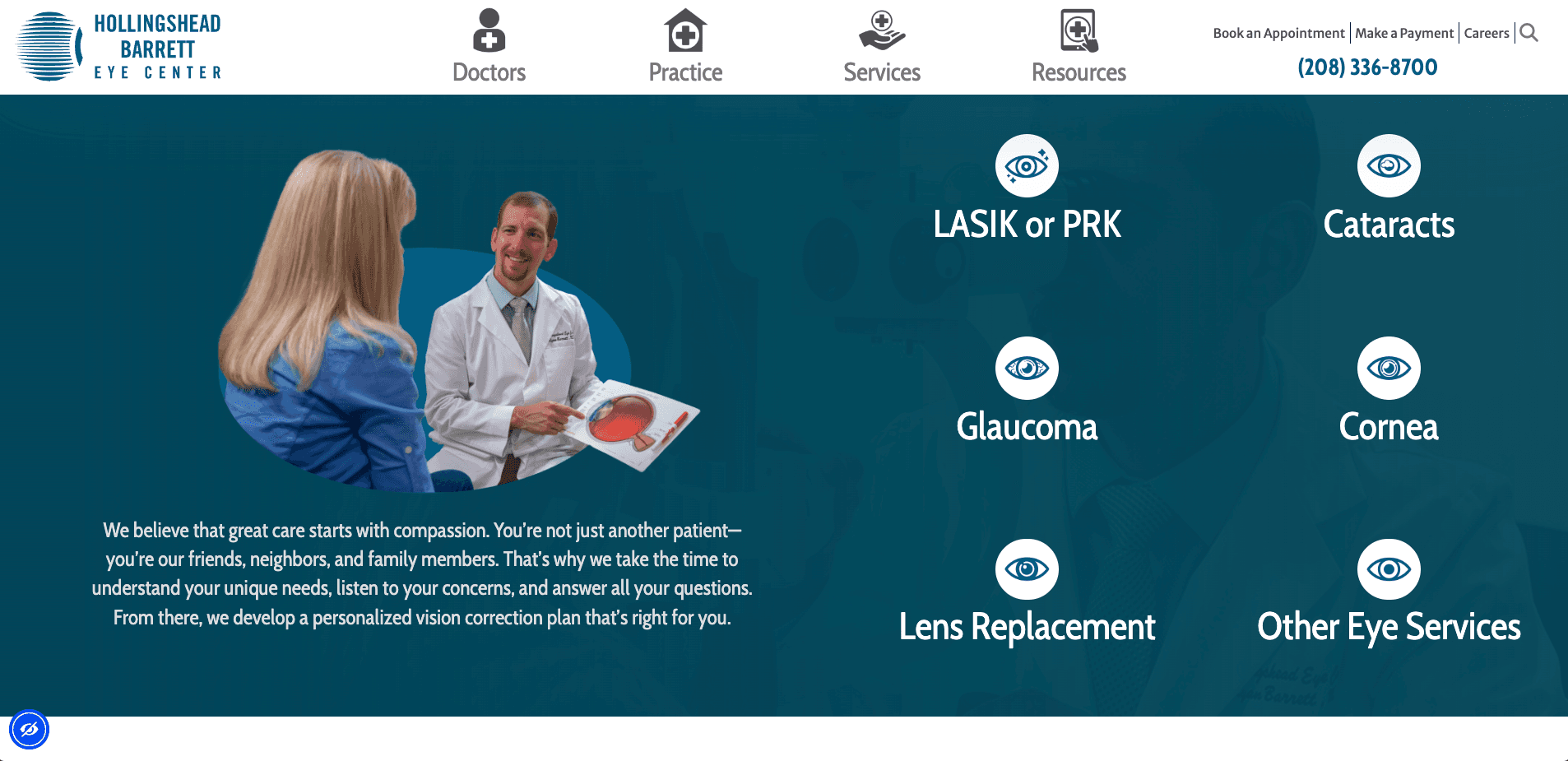
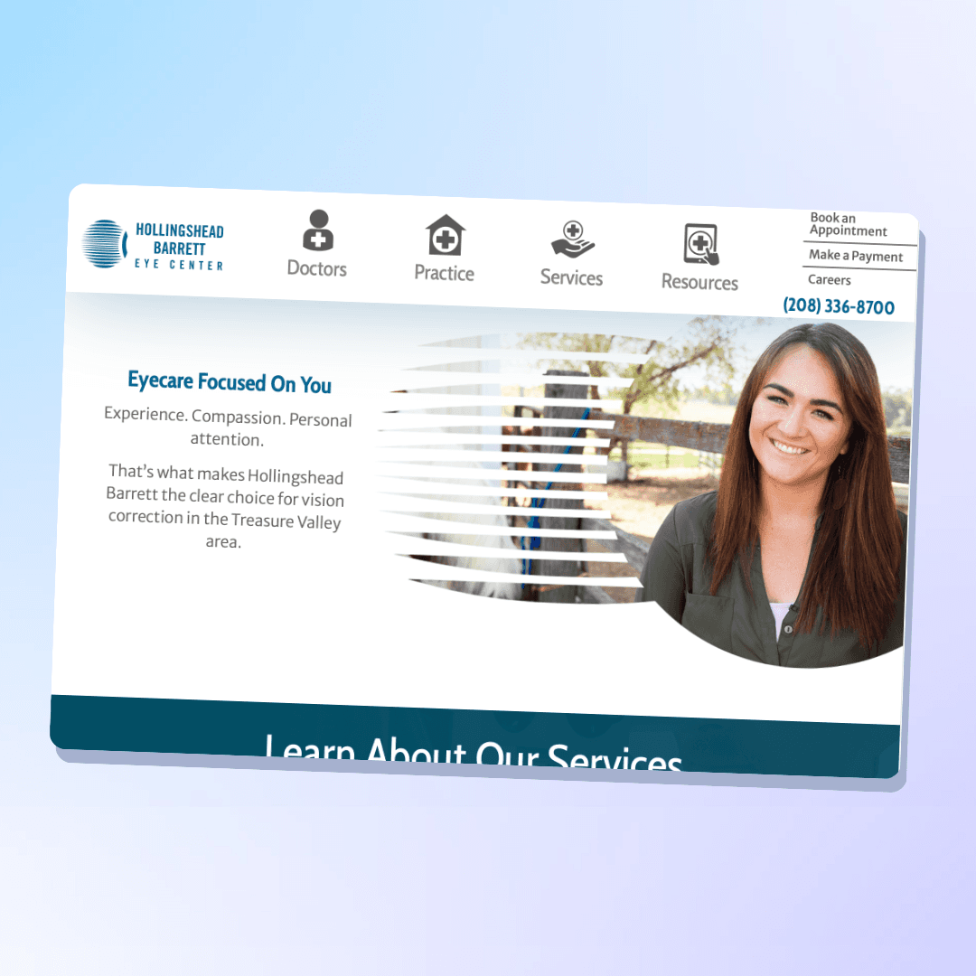
Well kind of. This is an in-progress project. I have conducted the research on the home page, doctors page, doctor profile, and services pages. I have noted that the IA is the biggest problem. The top navigation has been removed and the bottom navigation with icons (for better accessiblity visually) has been placed at the top. The font has been drastically increased to help the intended audience (visually impaired).
The Proof is in the pudding
The Visuals
The Proof is in the pudding
The Visuals
The Proof is in the pudding
The Visuals
Click the arrows to see the:
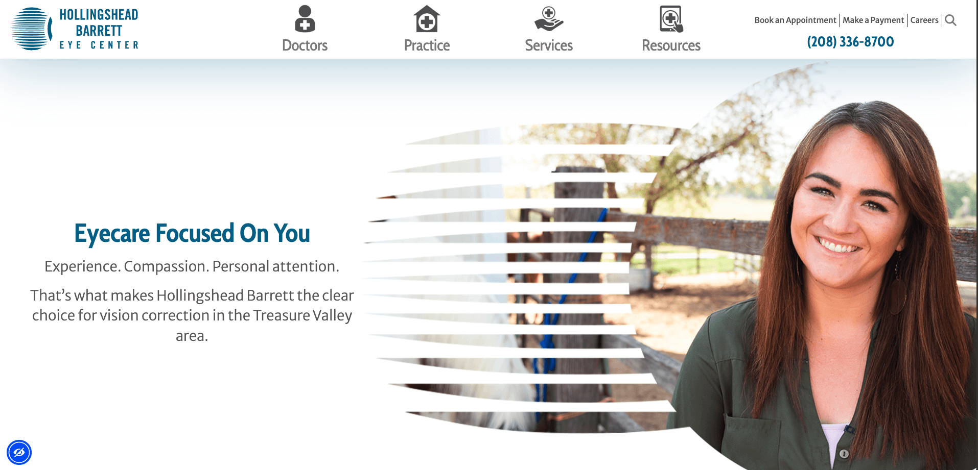
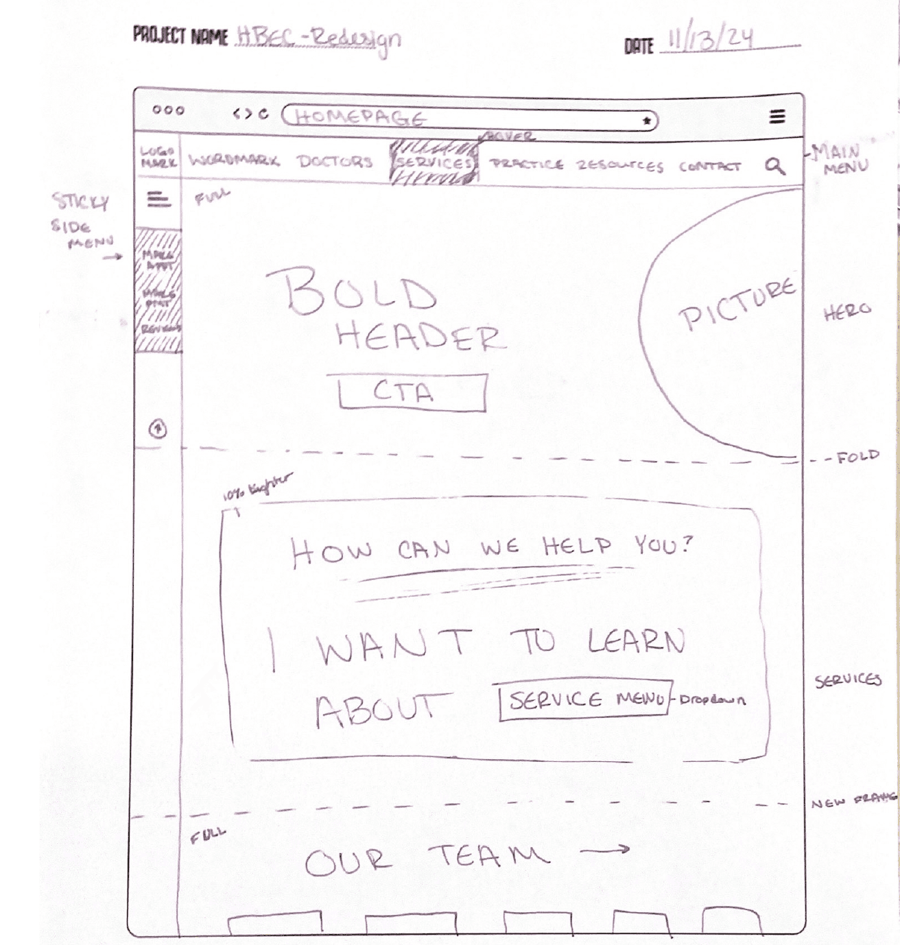
Hero Section
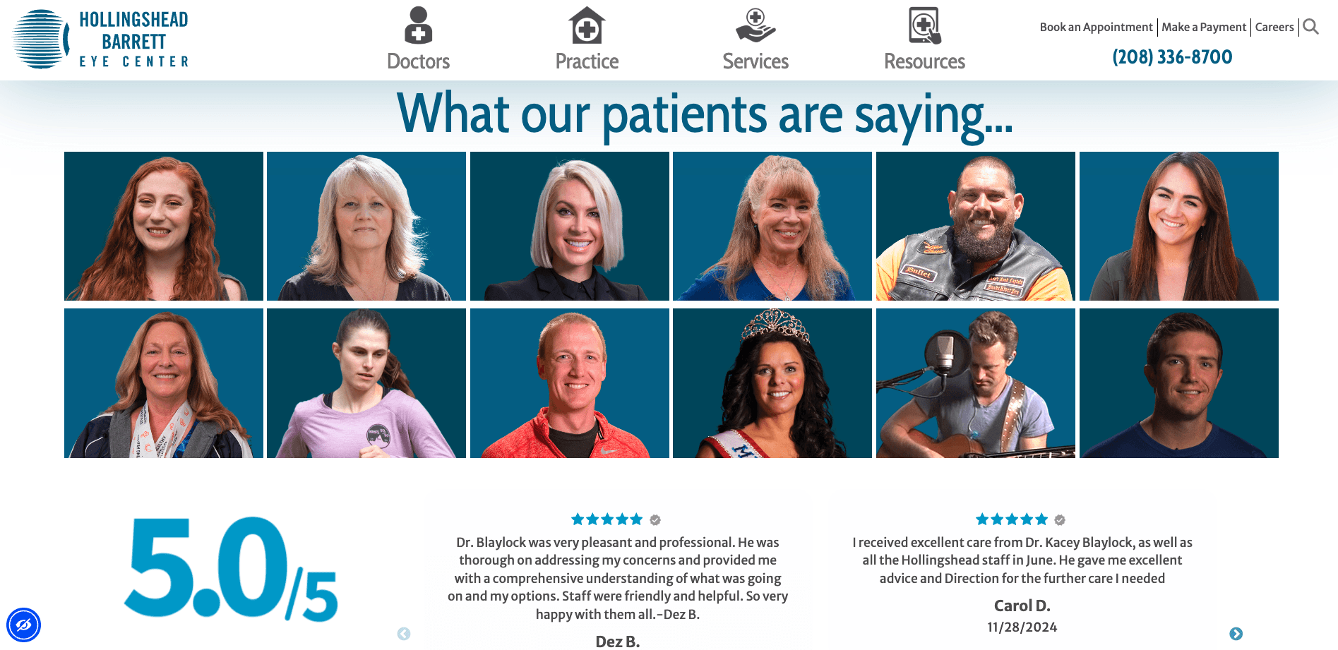
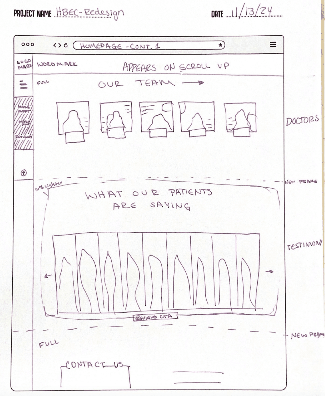
Testimonials
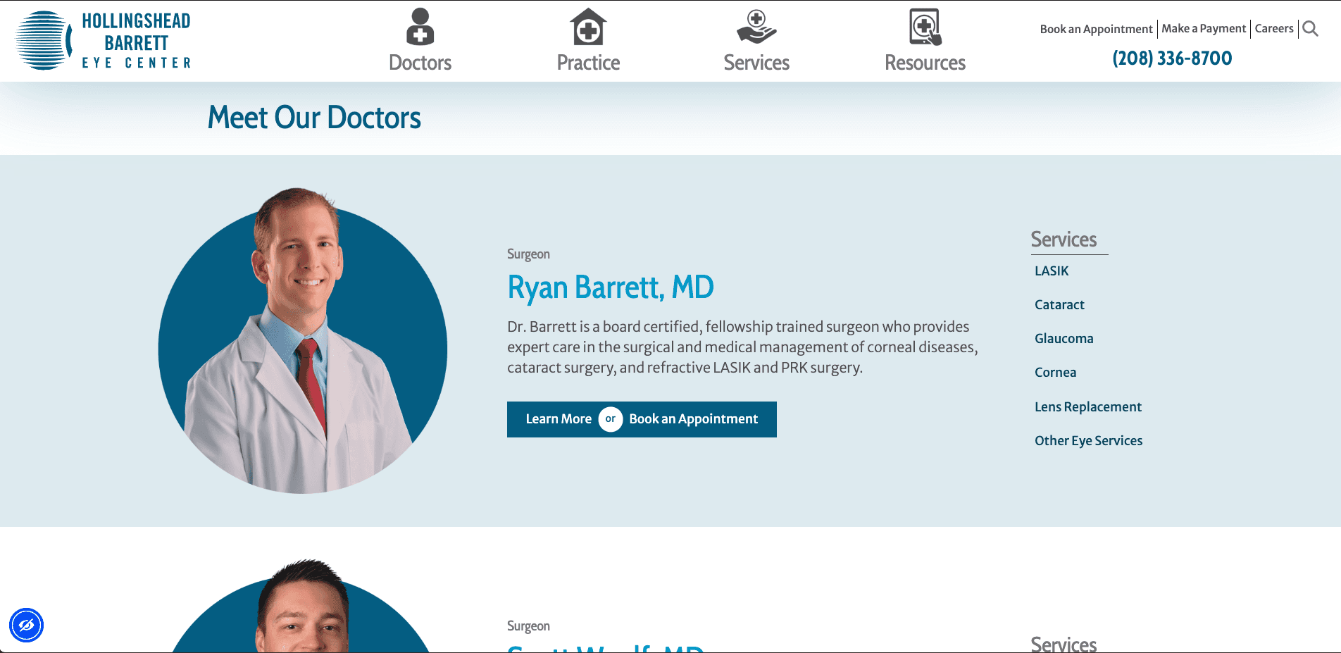
Doctors Page Layout
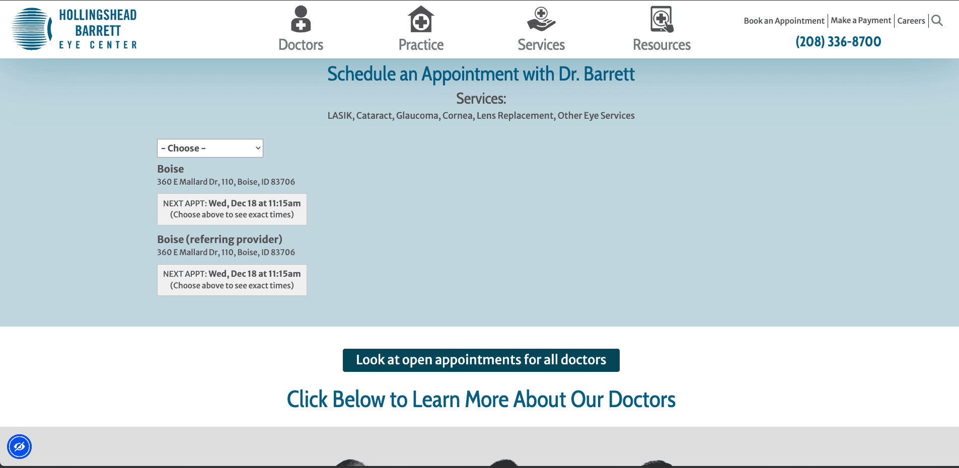
Booking Appointment Section
Services Section
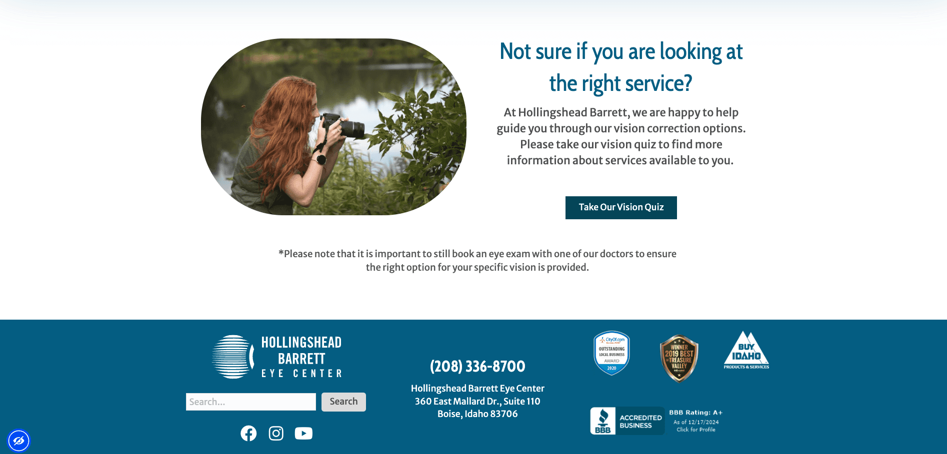
Vision Quiz
The Lowdown
The Story
The Lowdown
The Story
The Overview
The center’s website is outdated and doesn’t effectively highlight its services for patients. The goal of the UX/UI redesign is to create a seamless, informative, and visually appealing site that enhances user experience, improves patient conversion, and introduces a new approach to care.
Discovery
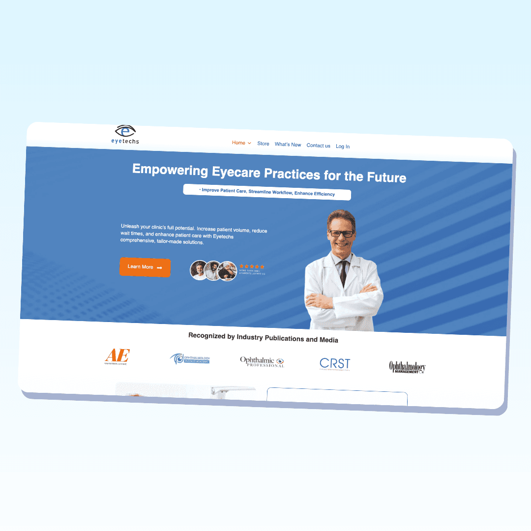
I researched user sessions to understand website navigation and identified simpler elements on competitor sites. I focused on visual branding and imagery to create a more welcoming atmosphere for patients. Given the practice’s strong reputation, ensuring easy access to client video testimonials was also a priority.
The Problem
While the practice has a reputable brand, its goals are evolving. The website struggles to effectively translate its services and user needs. The challenge is to update the content to align with the new patient-focused approach and guide users to the right CTAs
My Reflections
With research driven design this site has the potential to showcase the reputation, redirect the patient narrative, guide to the correct CTAs, and make easier and viewable experience for potential clients. There were things that had to be pushed down in priority like the vision quiz to ensure CTAs were completed.
The Lowdown
The Story
The Lowdown
The Story
The Overview
The center’s website is outdated and doesn’t effectively highlight its services for patients. The goal of the UX/UI redesign is to create a seamless, informative, and visually appealing site that enhances user experience, improves patient conversion, and introduces a new approach to care.
Discovery
I researched user sessions to understand website navigation and identified simpler elements on competitor sites. I focused on visual branding and imagery to create a more welcoming atmosphere for patients. Given the practice’s strong reputation, ensuring easy access to client video testimonials was also a priority.
The Problem
While the practice has a reputable brand, its goals are evolving. The website struggles to effectively translate its services and user needs. The challenge is to update the content to align with the new patient-focused approach and guide users to the right CTAs
My Reflections
With research driven design this site has the potential to showcase the reputation, redirect the patient narrative, guide to the correct CTAs, and make easier and viewable experience for potential clients. There were things that had to be pushed down in priority like the vision quiz to ensure CTAs were completed.
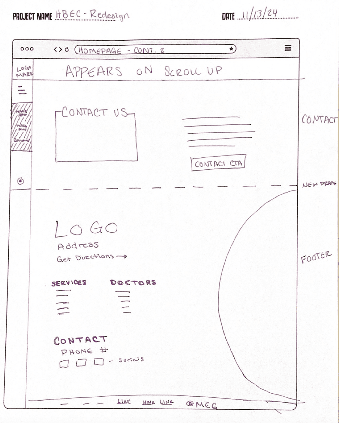
Looks Kinda Sketchy
The Journey
Looks Kinda Sketchy
The Journey
Looks Kinda Sketchy
The Journey
Looks Kinda Sketchy
The Journey
The Inside track
The Process
The Inside track
The Process
The Inside track
The Process
Looks Kinda Sketchy
The Journey
Looks Kinda Sketchy
The Journey
Other Projects
Other Case Studies
Check our other project case studies with detailed explanations
Other Projects
Other Case Studies
Check our other project case studies with detailed explanations
Other Projects
Other Case Studies
Check our other project case studies with detailed explanations
The Proof is in the pudding
The Visuals
The Proof is in the pudding
